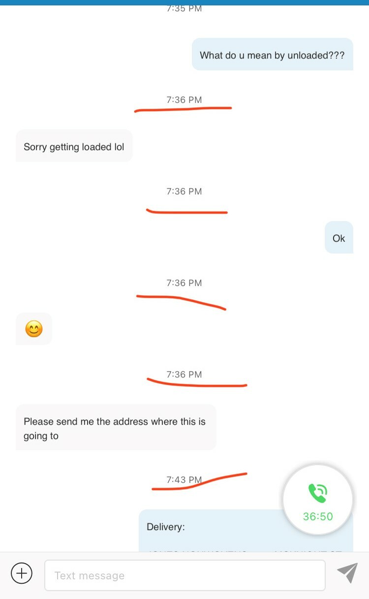
With the newer version of Ring Central app, the developing team also included to show time stamps on every text that you send or receive. Which is annoying at times because me and my coworker text a lot for business and on my phone screen it only shows 3-4 msgs and 8 time stamps when those msgs were texted which is basically the same time i.e. less than within a min texting time.
So ideally like how iPhone's iMessage has a feature of hiding the time stamp and slide left on the text message to see what time it was recd or sent will save a lot of space on screen for back in forth texters like me. If we cannot have the feature like iMessage , we can always go back to the previous texting time stamp patterns.
To be honest - its the most annoying thing to see time stamps more than texts their(highlighted with red lines) - for more clarifications I've attached a text snapshot between 2 co-workers.

